
Summary
- High-end design is calm, consistent and fast.
- Seven principles, from white space to speed, define the premium look.
- Most premium choices also make a site faster.
- Stock photos, sliders and pop-ups instantly lower the look.
The Short Answer
A website looks high-end when it's calm, consistent and fast: generous white space, two well-chosen fonts, your own photos in one style, a limited color palette, subtle motion, one clear path to book and pages that load quickly on a phone.
Luxury online isn't about adding effects. It's about removing everything that doesn't belong.
The 7 Principles of a High-End Website
These seven principles appear on almost every premium brand site, and each one also affects how fast your site loads.
1. Generous White Space
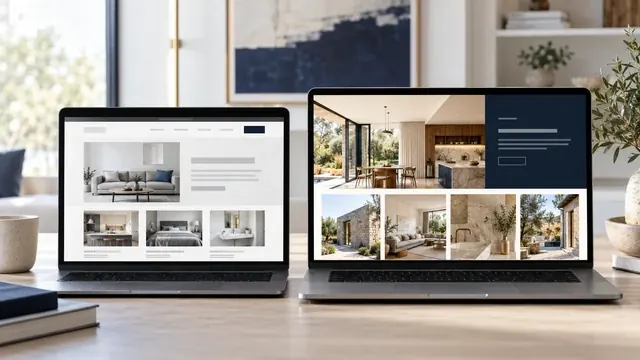
Space is the clearest signal of confidence: a premium site lets each element breathe instead of filling every corner.
Crowded pages feel like a discount store. Give headlines room above and below, keep margins wide and show fewer things at once.
Impact on speed: Space costs nothing to load, so it's the fastest luxury you can add.
2. Restrained Typography
High-end sites use two typefaces at most, with a clear hierarchy from headline to body text.
An elegant display font for headlines and a clean, readable font for everything else. Consistent sizes, generous line spacing, nothing random.
Impact on speed: Fonts are hosted on your own site and preloaded, so text appears quickly.
3. Photos That Look Like One Brand
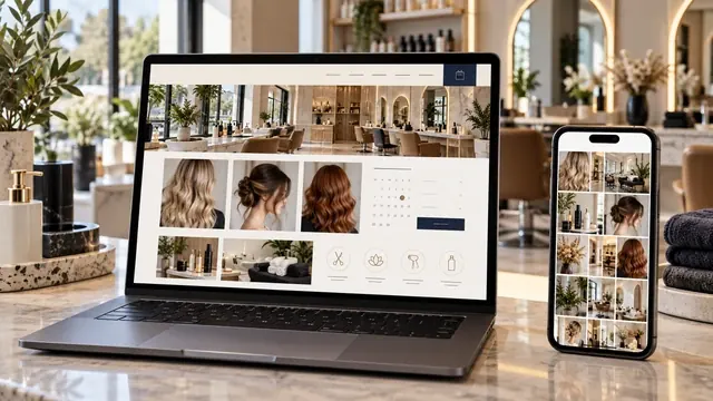
Premium sites use your own photos, edited in one consistent style, instead of stock images seen everywhere.
Same lighting, same color mood, same framing. Ten consistent photos beat a hundred random ones.
Impact on speed: Every image is resized and compressed to a modern format before it goes online.
4. A Calm, Limited Color Palette
A few colors used with discipline look richer than many colors competing for attention.
One background tone, one text color and one accent used sparingly for buttons and details.
Impact on speed: A limited palette also means less code.
5. Subtle Motion, No Gimmicks
Luxury sites move gently, if at all: soft transitions instead of sliders, pop-ups and flashing effects.
Motion should guide the eye, not demand it. Sliders hide content and often slow pages; we avoid them entirely.
Impact on speed: CSS transitions add almost no weight.
6. One Effortless Path to Book
A premium site never makes clients hunt for how to book; one elegant button follows them through the page.
Fewer choices feel more exclusive. Make the next step obvious on every page, especially on a phone.
Impact on speed: A simple form loads instantly.
7. Speed as Part of the Experience
A beautiful site that loads slowly doesn't feel luxurious; it feels broken.
Clients judge a brand in seconds. A fast site feels polished in the same way a well-run studio does.
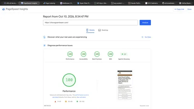
Impact on speed: We target 95 to 100 on Google PageSpeed for every page.
Audit Your Website in 5 Minutes
Open your site on your phone and compare it with the two columns below.
| Check | Template look | High-end look |
|---|---|---|
| Count the fonts | Three or more | Two at most |
| Look at the photos | Stock images, mixed styles | Your own photos, one style |
| Scroll the home page | Crowded blocks, many buttons | Calm sections, one main action |
| Watch it load on your phone | Slow, jumping content | Fast and stable |
| Count the colors | Many, used everywhere | Three or four, used with discipline |
Mistakes That Make a Brand Look Ordinary
Some common choices instantly lower how premium a brand feels, even with a great logo.
- Stock photos of smiling models instead of your real work and space.
- Sliders that rotate before anyone can read them.
- Pop-ups that appear the moment someone arrives.
- Too many fonts, colors and buttons fighting for attention.
- Slow pages caused by huge, uncompressed images.
Related Guides
If most of your clients find you on social media, read is Instagram enough for a salon. And to see why handcrafted sites feel different, read template vs handcrafted website.
Key Terms in Plain English
These are the terms used in this guide, each explained in one sentence, the same way we explain them on our calls.
- WCAG 2.2 AA
- The international accessibility standard that makes websites usable for people with disabilities; level AA is the level most businesses aim for.
- WebP
- A modern image format that keeps photos sharp at a fraction of the file size, so pages load faster on phones.
- Google PageSpeed Insights
- Google's free test that scores how fast a page loads, from 0 to 100, on phones and on computers.
- Call to action
- The button or link that tells a visitor what to do next, such as calling you or requesting a quote.
Frequently Asked Questions
These are the questions owners ask us most about this topic.
What makes a website look expensive?
White space, restrained typography, consistent photos, a limited palette, subtle motion, a clear booking path and fast loading.
Do premium websites have to be slow?
No. The most refined sites are often the fastest, because they carry nothing extra. Compressed images and clean code keep them quick.
Can a template look high-end?
Some can, with careful editing, but they often carry extra code and look like other sites using the same template.
How many fonts should a luxury website use?
Two at most: one for headlines and one for body text, used consistently.
Are sliders bad for a premium website?
Usually. They hide content, slow pages and are often ignored. Calm, fixed layouts feel more premium.